Reimagining the Ya Kun app
A UXUI Case Study

Ya Kun Kaya Toast outlet at HDB Hub. Source: Ya Kun Facebook Page.
Background
Ya Kun Kaya Toast is a household brand that is no stranger to any Singaporean. Well-known for their aromatic coffee and tea, soft-boiled eggs, and kaya toasts, Ya Kun is no doubt a successful business. The brand launched their mobile app in January 2018, with the goal of allowing its customers to collect points for their purchases and redeem rewards in exchange.

Motivations
Despite the beloved Singaporean brand’s success, many users remain dissatisfied with the app, as evidenced from its 1.7 star rating on the Google Play Store based on 402 reviews. App store reviews highlighted a common issue — while the app allows mobile payment, users still have to queue up physically to order at the cashier.
Nonetheless, the Ya Kun app has 50K+ downloads, which suggests that there is great value in improving its user experience as many would benefit from it. Our objective was to redesign the Ya Kun app’s self-ordering mobile experience.


The Current User Journey
The existing user journey map evidently showed how users needed to shuffle back and forth between physical and in-app touch points in order to accomplish their goal of purchasing an item from Ya Kun, prompting us to relook into the user journey.
Personas & Customer Journeys
We began this phase by creating two user personas and their respective user journeys based on the previously collected insights. We utilized both personas and user journeys as it gave us a deeper understanding of our target audience’s expectations, challenges, and motivations.


Ideation

Based on the issues we have identified through the journey maps, we turned them into potential opportunities through How-Might-We questions. We then shortlisted 5 questions and brainstormed ideas for each of them to find solutions to meet the needs of Ya Kun app users like both Xiao Ming and Sabrina.
The ideation reaped 5 ideas that we decided to prototype.
-
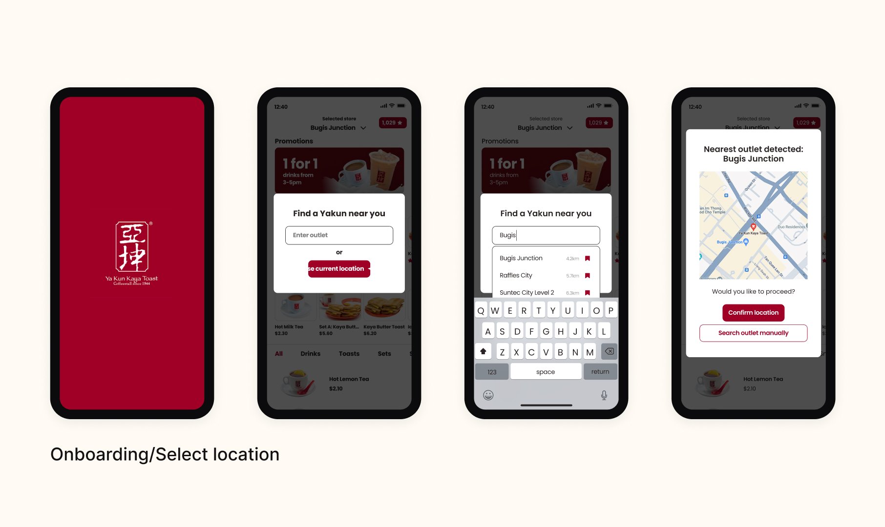
01 / Store Locator
NEW FEATURE
Integrate a map to help users find the nearest Yakun outlet.

-
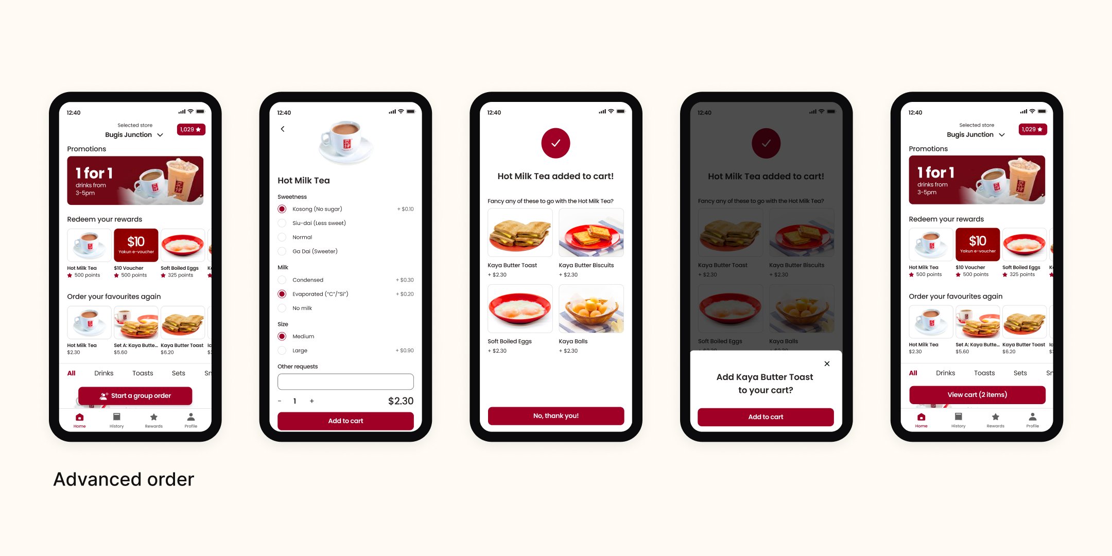
02 / Advance Order
NEW FEATURE
Include an advance order function so that users can make their orders on the go, and pick it up from the location after.

-
03/ Order Again
NEW FEATURE
Personalise the user’s experience by giving them the options to order their favourites again.

-
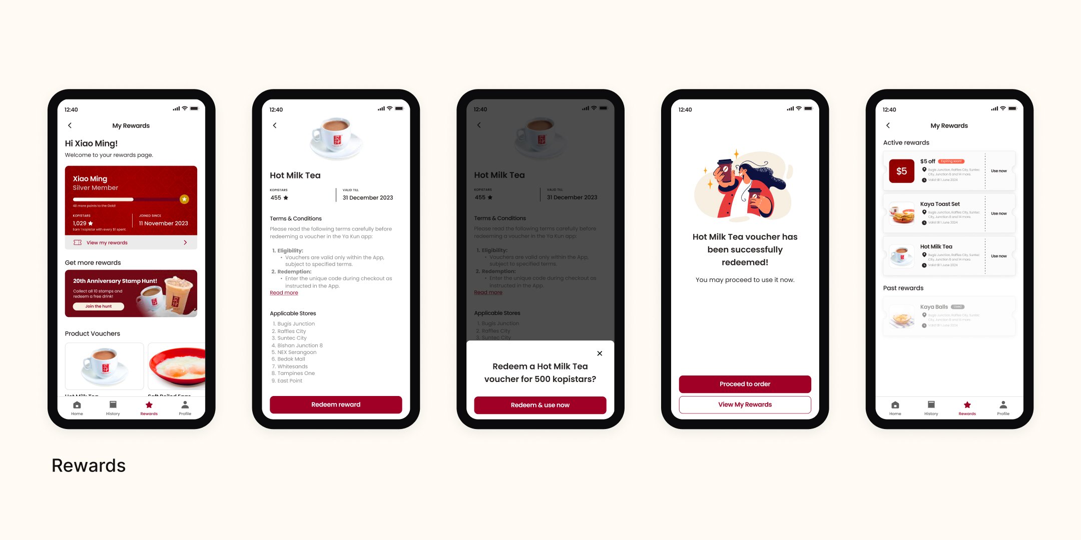
04 / Rewards
IMPROVEMENT FEATURE
Improve the transparency and accuracy of the vouchers and its applicable stores.

-
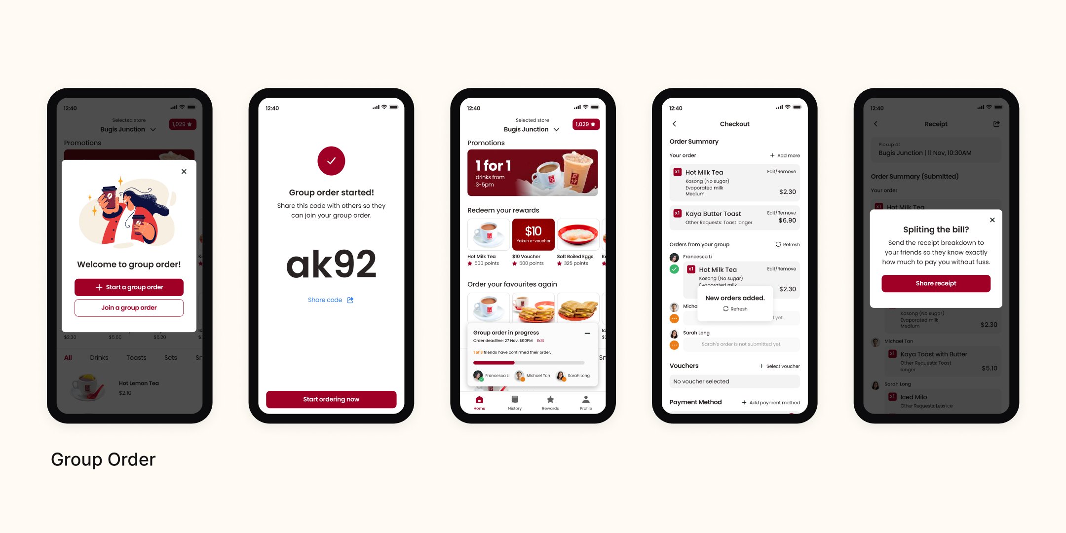
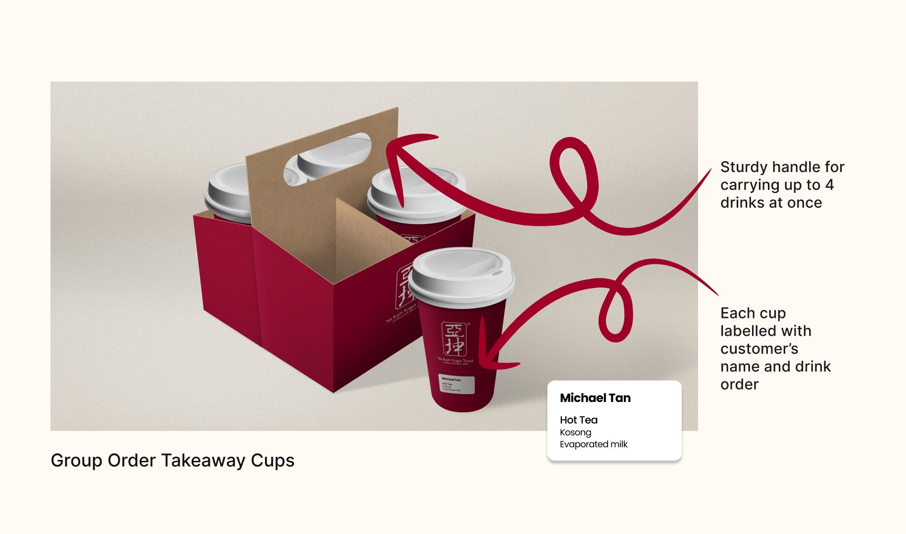
05 / Group Order
NEW FEATURE
Create a group order feature that allows easy consolidation of everyone’s unique customisation, and a packaging solution for group orders.

Testing
In order to test how our users would interact with our app under various circumstances, we came up with different scenarios, ran a test with 5 users and recorded our findings with the Rose Bud Thorn method.
This test provided us with validation for the features we introduced. It helped us assess whether their pain points and needs are being met, as well as identify usability issues that might not have been apparent to us.


Quotes from our testers
“Very intuitive, like actually using a normal app”
“Tea was very easy to order as it was in favourites”
“Can refresh to get new orders”
“Nearest location selection is good”
“Very intuitive, like actually using a normal app” “Tea was very easy to order as it was in favourites” “Can refresh to get new orders” “Nearest location selection is good”
“Nice to have Rewards front and centre on home page”
“Clicking link to join group order is more intuitive”
“Add a queue number status in the home page”
“Favourite past order rather than product”
“Nice to have Rewards front and centre on home page” “Clicking link to join group order is more intuitive” “Add a queue number status in the home page” “Favourite past order rather than product”
“Don’t know the difference between Redeem and Redeem & Use Now”
“The heart button beside the product, assumed that it is a selection”
“Did not notice the dine in/pick up buttons”
“Does not notice group order”
“Don’t know the difference between Redeem and Redeem & Use Now” “The heart button beside the product, assumed that it is a selection” “Did not notice the dine in/pick up buttons” “Does not notice group order”
Final Prototypes